Why Do Bold Shapes Matter More Than Tiny Costume Details in Profile Icons?
In the world of online gaming communities and casual chat platforms like Discord, profile icons are more than just pictures—they’re identity badges, affiliation signs, and sometimes even conversation starters. However, aspiring digital artists and moderators often find themselves debating: should an avatar focus on detailed costumes and intricate designs, or should it emphasize bold, simple shapes?
Having moderated gaming communities for over a decade and helped numerous esports teams standardize their visuals, I can confidently tell you: bold shapes and strong silhouettes matter far more than tiny costume details when it comes to profile icons. In this post, I’ll dive into the essential reasons why shape recognition, mobile-first readability, contrast and separation, and face and expression clarity all converge to make bold icon design the superior choice.
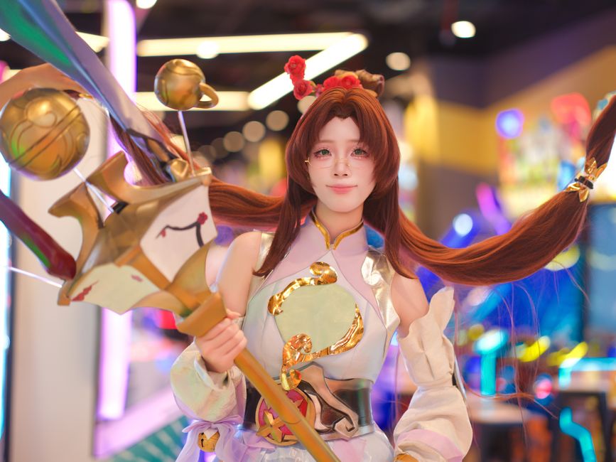
Understanding Shape Recognition
Shape recognition is the brain’s natural ability to identify objects by their overall outline or silhouette rather than by examining every fine detail. When users glance at profile icons—either in a crowded Discord server sidebar, a small mobile overlay, or a fast-paced esports overlay—their brains rely on these instant shapes to decode identity.
Why Silhouette is King
- Instant recognition: The human brain can recognize familiar shapes in as little as 100 milliseconds—even before focusing on specific details.
- Memory recall: Our visual memory catalogs icons based on their broad features, so a strong silhouette is easier to remember.
- Noise reduction: Complex details tend to blur at small sizes, but bold shapes retain clarity and distinctiveness.
For example, think about popular brand logos like Twitter’s bird or Nike’s swoosh. These logos rely on simplicity and bold contours, not intricate patterns or tiny text. Similarly, profile icons need clear silhouettes to be instantly recognizable across all digital environments.
Mobile-First Readability: Where Most Users See Your Icon
Here's what kills me: discord and many gaming communities are accessed primarily via mobile devices. Mobile screens are small, and icons are often rendered tiny—sometimes 40x40 pixels or less. This makes it vital that avatar designs prioritize mobile readability.
What Mobile Viewing Demands
- Reduced size means detail loss: Tiny costume elements like ornate ribbons, buttons, or minuscule symbols tend to vanish or turn into visual noise.
- Faster recognition required: Mobile users often scan names and avatars quickly in hectic chats, so the icon needs to communicate identity immediately.
- Contrast is king: Bold shapes combined with high contrast ensure icons pop on different backgrounds and lighting environments.
By testing avatars on both light and dark Discord themes—a practice I always recommend and personally adhere to—you ensure that your icon remains effective regardless of user settings. Designing with a circle-shaped crop preview, rather than a square, also helps anticipate how your icon appears in the actual platform context.
Contrast and Separation: Avoiding the 'Visual Noise' Trap
Another problem tiny costume details bring is creating 'noise'—too many little elements fighting for attention. This results in visual confusion rather than clarity. Bold shapes inherently avoid this because they emphasize the “big pfp design picture.”
Practical Tips for Contrast and Separation
- High contrast color choices: Use colors that stand out distinctly against each other and the background, such as complementary or triadic color schemes.
- Clear shape boundaries: Avoid blended or blurry edges; crisp boundaries help in defining the character silhouette.
- Minimal overlapping elements: Stagger costume parts or character limbs to keep each part recognizable on its own.
Bold shapes enforce natural visual grouping, meaning every part of the icon works together rather than competing for attention.
Face and Expression Clarity: The Heart of Profile Icons
Faces are central to identity and connection. For profile icons, conveying a readable expression is crucial for emotional engagement and user recognition.
Challenges with Tiny Faces
- Too small to read emotions: Faces cropped too tightly or scaled down lose detail on eyes, mouth, and eyebrows—expressions become unreadable.
- Intimidating or bland vibes: When a face becomes an indistinct blob, it can lose personality or worse, become off-putting.
- Unintentional distractions: Tiny costume details can draw attention away from the face, which should be the focal point.
Here's a story that illustrates this perfectly: made a mistake that cost them thousands.. How bold shapes help: By enlarging the face area within the icon and simplifying surrounding costumes into recognizable shapes, you give users a clear window simple background pfp into the avatar’s personality. This fosters quicker and stronger recognition.
Common Mistakes to Avoid
Issue Why It Happens Impact How to Fix Reliance on tiny text Designer wants to include names, logos, or slogans within icon Text becomes unreadable at icon size; clutters image Use initials or strong shapes instead; omit text from avatar Busy backgrounds Trying to fit detailed scene or pattern around character Background turns to distracting noise; silhouette lost Use simple or solid color backgrounds with high contrast Faces cropped too small Focus on costume or props; face relegated to small area Expression unreadable; avatar feels impersonal Enlarge face area; prioritize expression clarityBest Practices for Designing Bold Profile Icons
- Start with a silhouette: Design your avatar so its contour can be recognized at a glance.
- Choose a circular crop preview: Since Discord and other platforms use circle avatars, crop your image this way early to check composition.
- Test on light and dark modes: Your icon should be equally striking on both backgrounds—adjust contrast and colors accordingly.
- Limit fine detail: Simplify costumes to big blocks of color or strong pattern elements, avoiding overly intricate detailing.
- Prioritize face and expression: Make sure the face occupies enough of the icon space to be legible and emotionally communicative.
- Keep a folder of ‘good silhouettes’: Curate personal references to inspire icon thumbnails that work well at small sizes.
Conclusion
When it comes to profile icons for platforms like Discord, bold shapes and clear silhouettes are the foundation of effective design. The combination of shape recognition, mobile-first readability, contrast and separation, and face clarity ensures that an avatar can do its job: representing a user in a clear, memorable, and emotionally resonant way—even at tiny sizes.
While it might be tempting to pack an icon with elaborate costume details or small text, doing so sacrifices recognition and legibility. Embracing bold, simple shapes helps your avatar stand out and be appreciated across all devices and contexts.
Remember to always preview your icon using a circular crop and test it on both light and dark Discord modes before calling it done. Your future community members (and moderators!) will thank you for the the clear, consistent identity you provide.