What Makes a Game Show Format “Recognizable” on a Tiny Phone Screen?
A game show can fill a studio with flashing lights, a giant set, a live audience and a host whose personality seems to occupy every corner of the room. A phone offers none of that space. Its screen is small, the viewer may be watching on the move, and every graphic has to compete with a thumb hovering over the controls.
Yet some formats remain instantly familiar when they move to mobile. A glance at a row of covered prizes, a distinctive wheel or a sequence of numbered choices can be enough to tell viewers what kind of game they are playing. The trick is not to squeeze a television studio onto a handset. It is to preserve the parts that make the format legible and memorable.
That means getting several things right at once: simple rules, a simple layout, clear cues and room for audience participation. It also means knowing when to adapt rather than replicate. The https://leisurebyte.com/from-television-to-interactive-games-what-makes-game-show-formats-so-adaptable/ most successful mobile versions do not necessarily look like miniature episodes. They make the central idea easy to understand and enjoyable to act on.
Recognition Is More Than a Familiar Logo
A logo can identify a show, but it cannot carry the whole experience. Recognition happens when several elements work together: the premise, the visual language, the rhythm of play and the moment-to-moment decisions. A returning viewer should be able to think, “I know what this is,” before reading a block of instructions.
On television, that recognition may come from a set, a host’s catchphrase or a familiar ritual repeated each episode. On a phone, those details have to be selected carefully. There is less room for decorative material, and the viewer may not be watching with full attention. A mobile adaptation needs to bring its most meaningful clues forward.
That is why iconic props matter. A wheel, buzzer, podium, mystery box or distinctive set of doors can compress a lot of information into one image. The prop is not simply decoration; it suggests how the game works. A wheel invites anticipation. A buzzer signals a race to answer. A box promises a hidden outcome. When that object is visible and easy to interpret, it helps establish the format at a glance.
Simple Rules Create Room for Personality
Mobile players often arrive without the benefit of a host explaining the rules aloud. They may be new viewers, returning fans who have forgotten a detail, or people opening a game during a short break. If the basic action is unclear, the experience can feel like homework before it feels like entertainment.
A strong format can usually be expressed as a short sequence: choose, reveal, answer, score. The exact steps vary, but the player should quickly understand what they can do, what happens next and what counts as success. That does not mean every game needs to be shallow. It means the entry point should be clear.
Once a player understands the basic loop, the game can introduce strategy, risk or surprises. Complexity works best when it grows from a familiar foundation rather than arriving all at once. A simple first decision gives the player confidence to stay and learn what makes later rounds interesting.
Keep the First Decision Obvious
In a TV studio, a contestant may have a host, a screen and an audience to guide attention. On a phone, the interface itself has to do more of that work. The most important action should be visually prominent and easy to reach. If the player is meant to tap a category, pick a door or submit an answer, that option should not be buried among secondary buttons.
Good onboarding is brief and timely. A short instruction shown at the moment it is needed is often more useful than a long tutorial displayed before play begins. If the player must choose between two options, explain those options there. If a special rule only matters during a bonus round, introduce it when that round starts.
- Use everyday language for the central action.
- Show what a button does before asking the player to rely on it.
- Keep rules consistent between rounds unless a change is clearly announced.
- Use examples or a practice turn when a mechanic is unfamiliar.
Instant Comprehension Makes Participation Possible
Audience participation is one of the pleasures of game shows. People at home like to guess along, call out an answer or debate what they would do in a contestant’s position. Mobile design can turn that instinct into direct interaction, but only if viewers understand the choice quickly enough to join in.
That creates a useful design test: can a player see the question, identify the available responses and make a choice without pausing to decode the screen? A phone-sized game should make the decision feel immediate, not obscure. Clear labels, readable text and distinct options help preserve the social energy of playing along.
Participation also depends on feedback. A tap should produce a response the player can see or hear. A selected answer might change color, a marker might move, or a short sound might confirm the choice. Without feedback, players may wonder whether their input registered. With too much feedback, they may feel interrupted. The aim is to make each action legible without turning every tap into a spectacle.
Coverage of entertainment formats by outlets such as Leisurebyte reflects how much discussion surrounds the identity and evolution of familiar shows. That same audience curiosity can carry into mobile versions: fans want to recognize the core game, while also seeing what has changed. The best adaptation gives them something to participate in, rather than asking them only to admire familiar branding.
Props, Layout and Cues Do the Heavy Lifting
When space is tight, every visual element should have a job. A simple layout reduces the effort needed to understand what is happening. It can place the current score, the active choice and the next action in clear locations, while leaving enough breathing room for the main prop or question.
That does not mean a phone game must look plain. Color, motion and sound can give it personality. The key is hierarchy: the most important information should be easiest to find. If a busy background competes with the answer choices, the design is making recognition harder rather than richer.
Animation and sound cues help connect an action to its outcome. A wheel can slow before it stops. A card can flip to reveal a result. A familiar chime can signal a correct answer or the start of a new round. These moments create rhythm and anticipation, translating some of the studio show’s energy into a more personal, handheld experience.
But animation and sound should clarify, not obscure. A long reveal can become tedious when repeated. A loud cue can be unwelcome in a public place, and some players will keep their phones muted. Important information must therefore remain visible: a sound can reinforce a win, but it should not be the only way to know that a win happened.
Build a Visual Vocabulary
Recognizable formats use recurring cues consistently. If a particular color means “locked in,” use it that way throughout. If a highlighted icon signals a bonus, make it behave consistently across screens. Familiarity grows through repetition, so a mobile adaptation benefits from a small visual vocabulary that players can learn quickly.
Element What it communicates Mobile design consideration Iconic prop The show’s identity or central mechanic Keep it large enough to recognize and tied to an action Simple layout Where to look and what to do next Prioritize the active choice and readable text Animation Change, suspense or a result being revealed Keep it brief, optional where practical and easy to follow Sound cue Confirmation, success, tension or transition Pair it with a visual signal so muted play still worksAdaptation Is Not the Same as Replication
A television format is built for a particular setting: a large set, a host, contestants, cameras and an audience watching at home. A phone game has different conditions. Its player may be alone, may have only a few minutes, and may use one hand. Reproducing the set piece by piece does not automatically reproduce the experience.
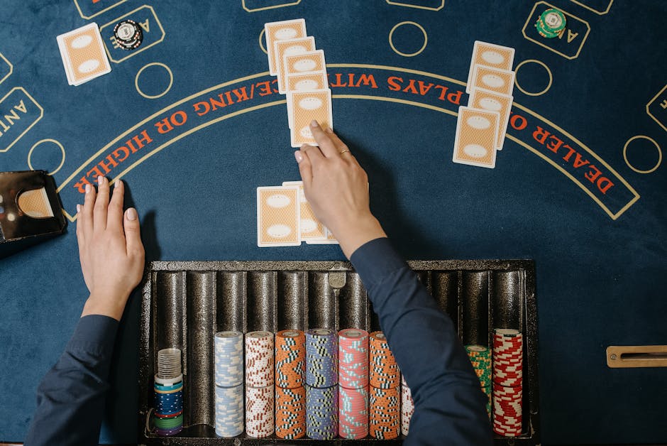
Adaptation asks a more useful question: what is the essence of this format? Perhaps it is the tension of choosing between a safe prize and a risky one. Perhaps it is the thrill of solving a clue under pressure or watching a familiar prop determine the outcome. Once that essence is identified, designers can reshape the surrounding details to suit mobile play.
Replication can still be valuable when the original look is central to the appeal. A faithful podium or sound sting may delight fans. But fidelity should not come at the expense of legibility. If a television-style graphic becomes tiny text, or a long studio sequence slows down a quick mobile session, the adaptation may need to simplify it.
The opposite mistake is stripping away so much that the game could belong to any brand. If the format’s distinctive props, rhythm and decision-making disappear, a logo alone may not make it feel recognizable. A thoughtful adaptation protects the signature elements while changing what the small screen cannot support.
Different Mobile Contexts, Different Expectations
“Mobile game” covers many experiences: a companion app for a broadcast, a casual quiz, a social play-along feature or a casino-style adaptation. Their rules and audiences differ, so the same design choices will not suit every version. A second-screen companion may need to sync with a live episode. A standalone game must explain itself without the show playing nearby.
Companies such as MrQ Casino operate in a different entertainment context from a traditional broadcast game show, but casino-style products still illustrate why immediate feedback and clear controls matter. When a mobile experience involves chance-based mechanics, its presentation should be especially transparent about rules, outcomes and the role of luck. A familiar prop can create recognition; it should not be used to make the mechanics seem simpler or more predictable than they are.
News organizations such as the Associated Press also cover the broader entertainment business, where established formats, licensing and digital distribution intersect. For creators, that wider landscape is a reminder that recognition has both a creative and a practical dimension: the audience should understand the experience, and the adaptation should be clear about what it is offering.
A Practical Test for a Recognizable Phone Format
Before launch, designers and editors can test the experience with a few direct questions. Can someone identify the central action after seeing one screen? Can they tell what just happened after a round? Do the show’s distinctive props or cues remain visible on a small device? And can the game still be played with the sound turned off?

A useful review can follow this sequence:
- Identify the signature. List the prop, ritual, choice or visual cue that makes the format distinctive.
- Reduce the rules to a loop. Describe the player’s basic action and the result it produces.
- Design for a glance. Put the question, choices and next step in a clear visual order.
- Use cues with purpose. Give animation and sound a consistent role, and provide visual confirmation.
- Test in real conditions. Try the game on a small screen, one-handed, in bright light and with audio muted.
These checks are simple, but they can reveal issues that are easy to miss in a design meeting. A tiny label may be readable on a large monitor and frustrating on a phone. A clever animation may look impressive once but slow down repeated play. A prop may be instantly recognizable to a fan yet meaningless to a first-time player unless the action around it is clear.
The Small-Screen Formula
A game show feels recognizable on a phone when its identity survives the journey without demanding that the screen imitate the studio. Iconic props provide a visual shortcut. Simple rules make the first move inviting. A simple layout and clear cues help players follow the action. Audience participation turns recognition into something active, while thoughtful adaptation preserves the format’s character in a new setting.
The goal is not to fit an entire television production into someone’s palm. It is to make one familiar idea unmistakable, one decision easy to understand and one result satisfying to see. When those pieces line up, even a tiny screen can carry the big feeling of a game show.